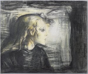
Edvard Munch’s ‘The Sick Child’ theme was one of his most renowned motifs—painted, etched, and lithographed. It’s a heart-touching story about his sister, Johanne Sophie (1862–1877), battling tuberculosis and sadly losing at just 15. Munch, deeply affected by the loss, spent a whopping 40 years revisiting her image on her deathbed, from 1885 to 1926.
Fast forward to January 2022, when I found myself immersed in a captivating investigation as part of a multi-disciplinary team composed of the technical art historian Jørgen Wadum and the conservators from Kunstkonserveringen. Our task was to scrutinise the potential originality of a coloured print belonging to a private collection. The subject depicted Johanne Sophie’s profile while lying on her deathbed, a lot like other Munch’s 1890s lithographs. So off we went all-in on some detective work—digging into the technical and historical details to figure out what’s what.
In this discussion, I want to direct my emphasis away from an in-depth interpretation of the results. Rather, my intent is to illustrate the technical approach I used throughout this specific investigation. If you want to know more, this case was featured on the docuseries episode “Mysteriet om ‘Den syge pige’“ aired on the Danish broadcast channel TV2 on 9 February 2023.
Technical examination
After a first close-up inspection, we ran a multispectral documentation that included:
- VIS – Visible colour in diffused light
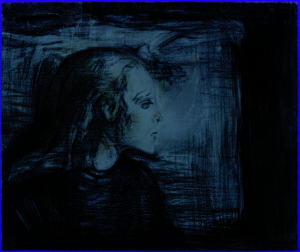
- UVL – UV-induced luminescence
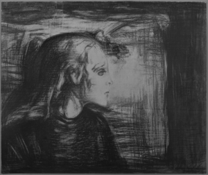
- IRP – Infrared photograph at 850 nm
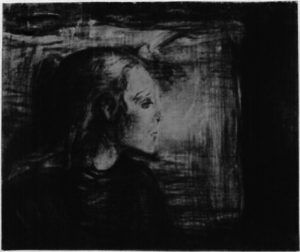
- UVR – UV reflectance at 365 nm
Left to right: visible colour in diffused light, UV-induced luminescence, UV reflectance, infrared photograph 850.
From the dataset I processed three image composites:
- CHR – Chromatic image
- FCIR – False colour infrared
- FCUV – False colour ultraviolet
Left to right: Chromatic image, false colour infrared, and false colour UV
The support was a thick sheet of paper, which was in turn glued on a larger piece of cardboard. The combination of the support and the backing board was too thick to be studied in transmitted light, therefore it was not possible to gather information on the structural properties of the support, its manufacture and the existence possible watermarks.
Nonetheless, the multispectral dataset already gave us precious insights on the materials, how the object was made, and other unexpected features. Although more selective and complementary methods are always suggested to validate any pigment identification, the dataset was sufficiently diverse to locate a small streak of Cobalt Blue thanks to the intense blue luminescence in UVL and bright pink signal in FCIR (Cosentino 2014). However, a study on Munch’s crayons does not list Cobalt Blue in his palette (La Nasa et al. 2021). Also the chromatic image proved useful in highlighting the swift and energic marks left with the yellow crayons.
Comparisons with Edvard Munch’s prints
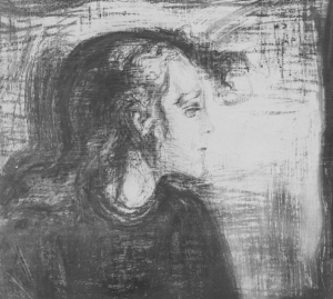
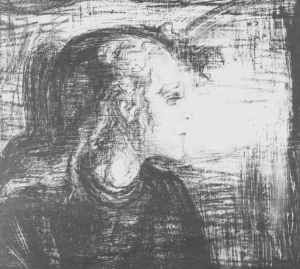
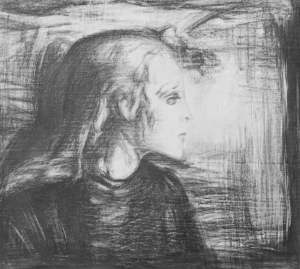
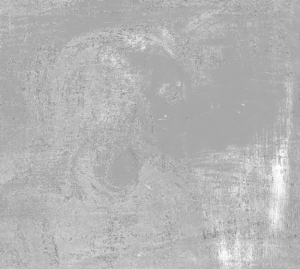
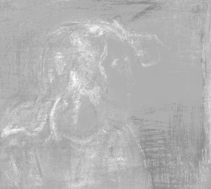
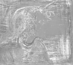
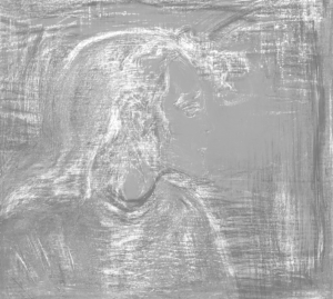
Another approach that we adopted was to “digitally borrow” some prints from the Munchmuseet and perform a direct comparison of The Sick Child II series with the one under study. This was done to visually locate any differences in the design and to determine if the print was actually done with the same lithographic stone.
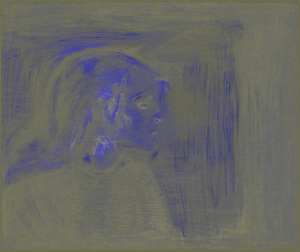
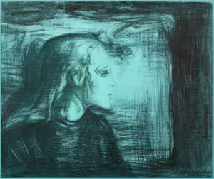
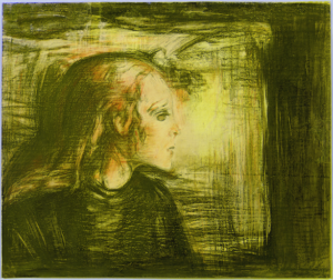
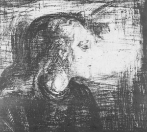
Alongside the diffused light image of the work under study, three prints were used from the Munchmuseet’s collection: MM.G.00203-13, MM.G.00203-17 and MM.G.00203-19. The elaboration consisted at first in minimising of the bias introduced by coloured areas. To start, I converted the colour space from RGB to Lab, of which I only kept the L* channel for further processing. The images were then stacked and registered to each other using a rigid registration algorithm to avoid any warping and distortion. Then, once all four images were stacked, I cropped them to a common region of interest.
Left to right: the L* channel of the work under study and the three Munchmuseet prints.
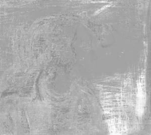
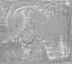
I obtained this “map of dissimilarities” with of a division between image pairs. The outcome of the operation, a weighted arithmetic operation between pixel values, is a grayscale image: drastically darker and lighter tones represent major differences between the two source images, while similar or identical pixels are represented by midtones (grey) values. For this case, I used the formula I = (i ÷ i’) x 70 + 100.
First, I ran the operation between the Munchmuseet prints in order to have a comparison baseline to what followed. Then, I divided the image of the print under study by each of the three Munch graphics. Although quite simple, this method has proven to be particularly useful in visually locating the numerous dissimilarities between seemingly similar scenes. Food for thoughts, if more source images were available, a more systematic approach with traditional bulk analyses would have been interesting.
Top row: the dissimilarity maps of the three Munchmuseet prints. Bottom row: the dissimilarity maps of the work under study against each of the three Munchmuseet prints.
References
- Cosentino, Antonino. 2014. “Identification of Pigments by Multispectral Imaging; a Flowchart Method.” Heritage Science 2 (1): 8. https://doi.org/10.1186/2050-7445-2-8.
- La Nasa, Jacopo, Brenda Doherty, Francesca Rosi, Chiara Braccini, Frederique T. H. Broers, Ilaria Degano, Jordi Moles Matinero, et al. 2021. “An Integrated Analytical Study of Crayons from the Original Art Materials Collection of the MUNCH Museum in Oslo.” Scientific Reports 11 (1): 7152. https://doi.org/10.1038/s41598-021-86031-6.


